eLearning Visual Refresh
A visual redesign of existing eLearning content
The organisation had recently undergone a rebrand, but its eLearning content no longer reflected this updated visual identity. While the instructional content remained relevant, the design felt outdated and inconsistent- there was no standard design guideline. Additionally, there were no guidelines in place for ensuring accessibility in learning materials. This project focused on elevating the look and feel of the learning experience using WCAG and accessibility standards to guide the design process.
Context
Working with existing content, I redesigned the eLearning assets with a focus on visual hierarchy, clarity, and brand consistency. I established a refreshed visual system covering layout, typography, colour, and interaction patterns and applied it across modules to create a more polished and engaging learning experience.
Process
Tools Used
Articulate Rise, Canva
Key Features

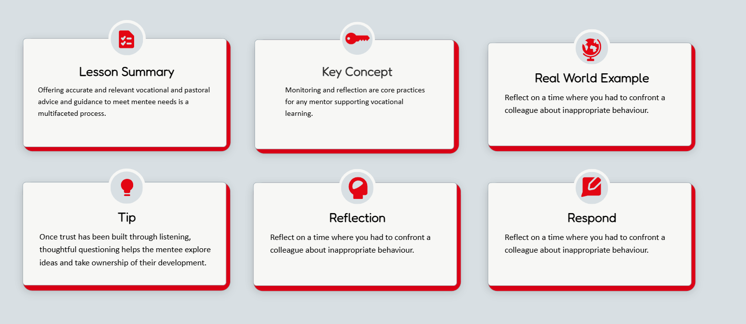
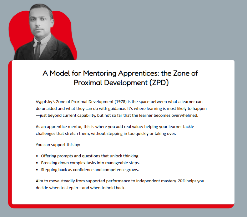
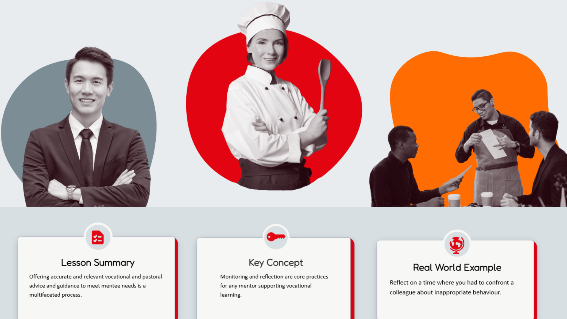
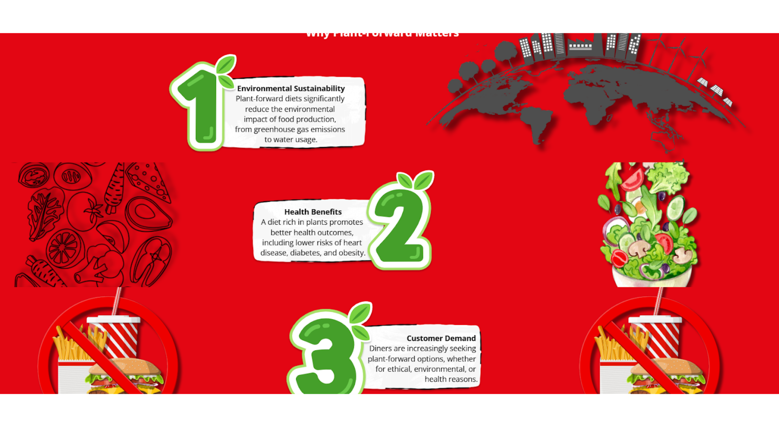
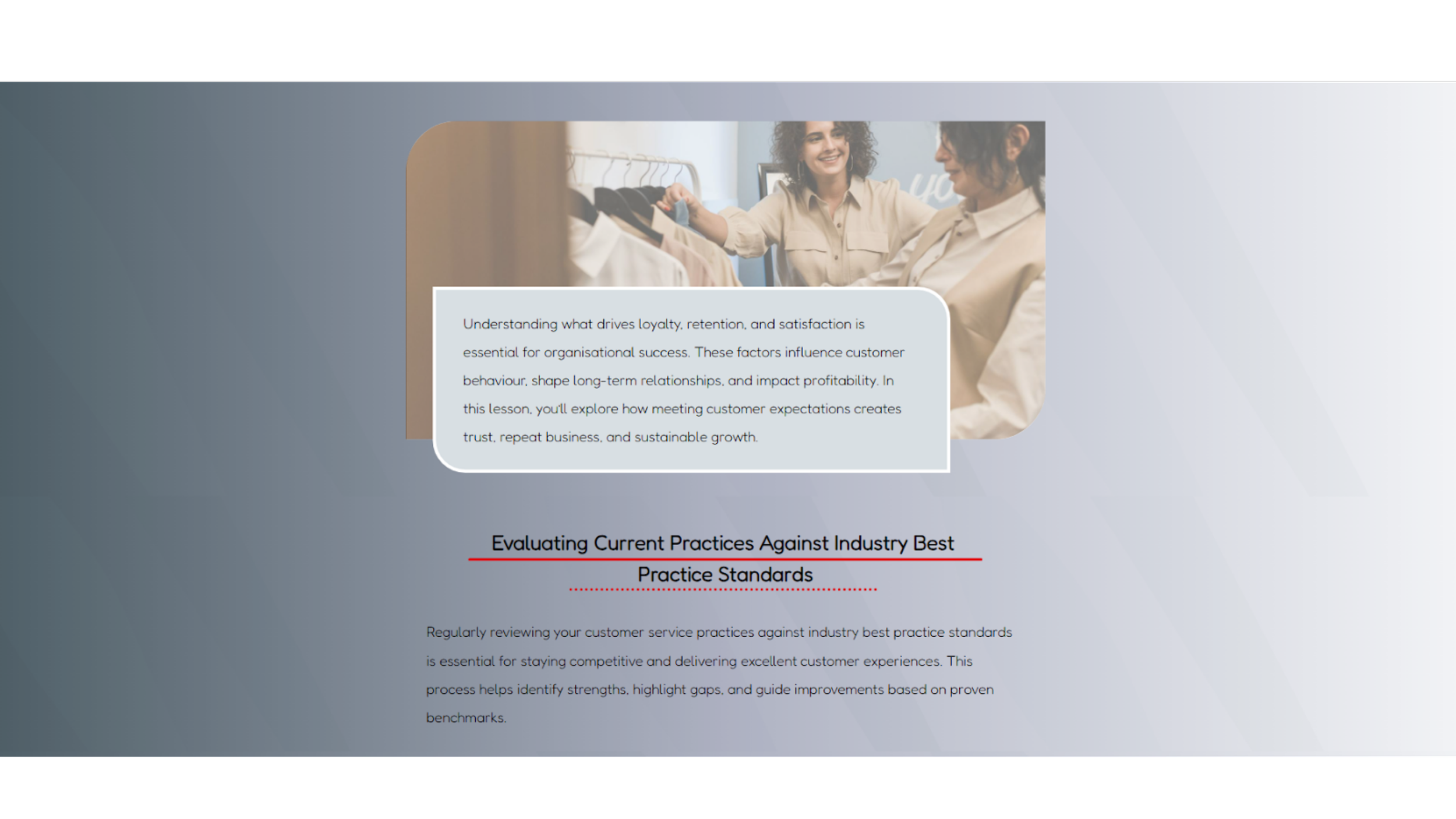
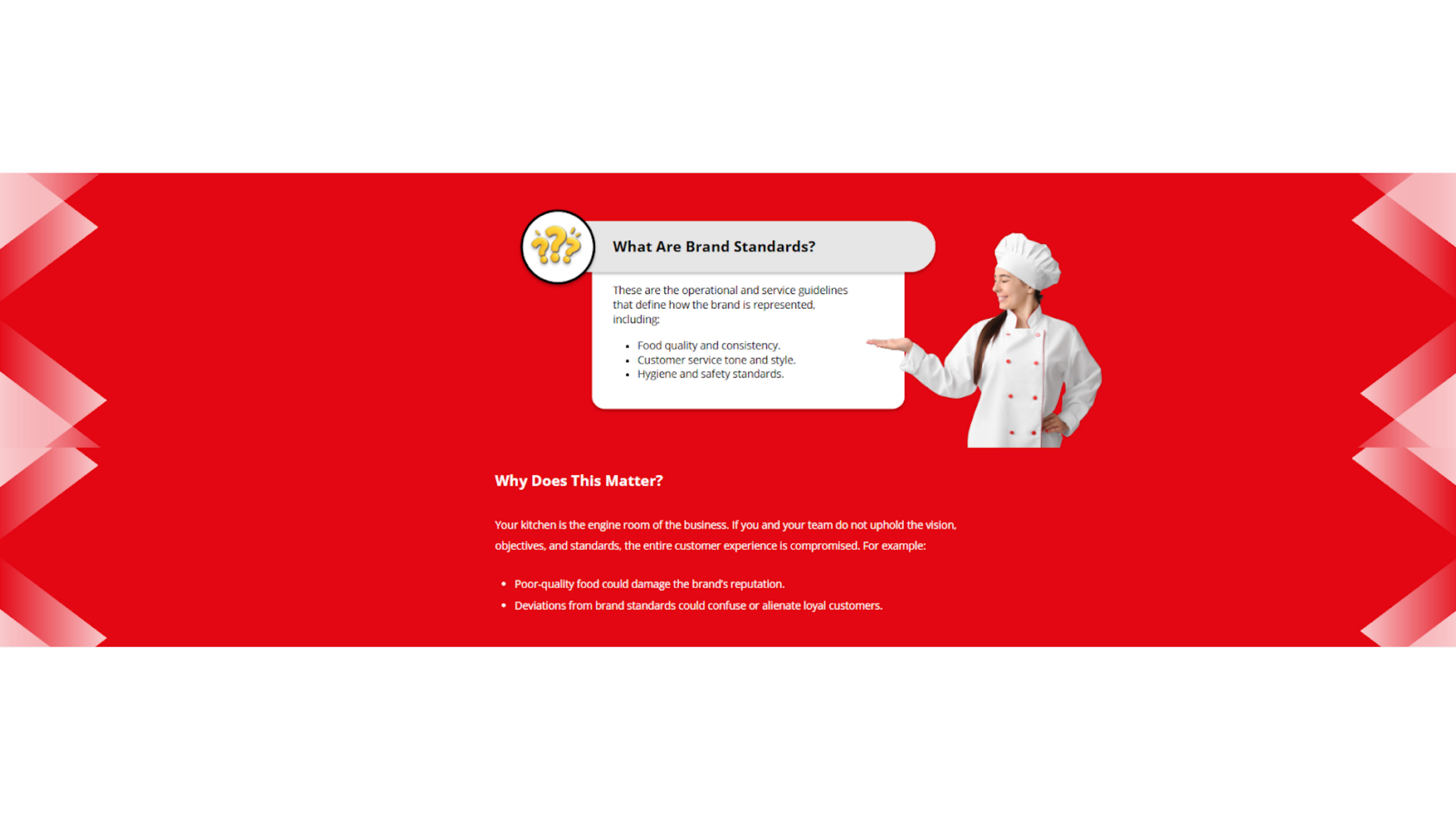
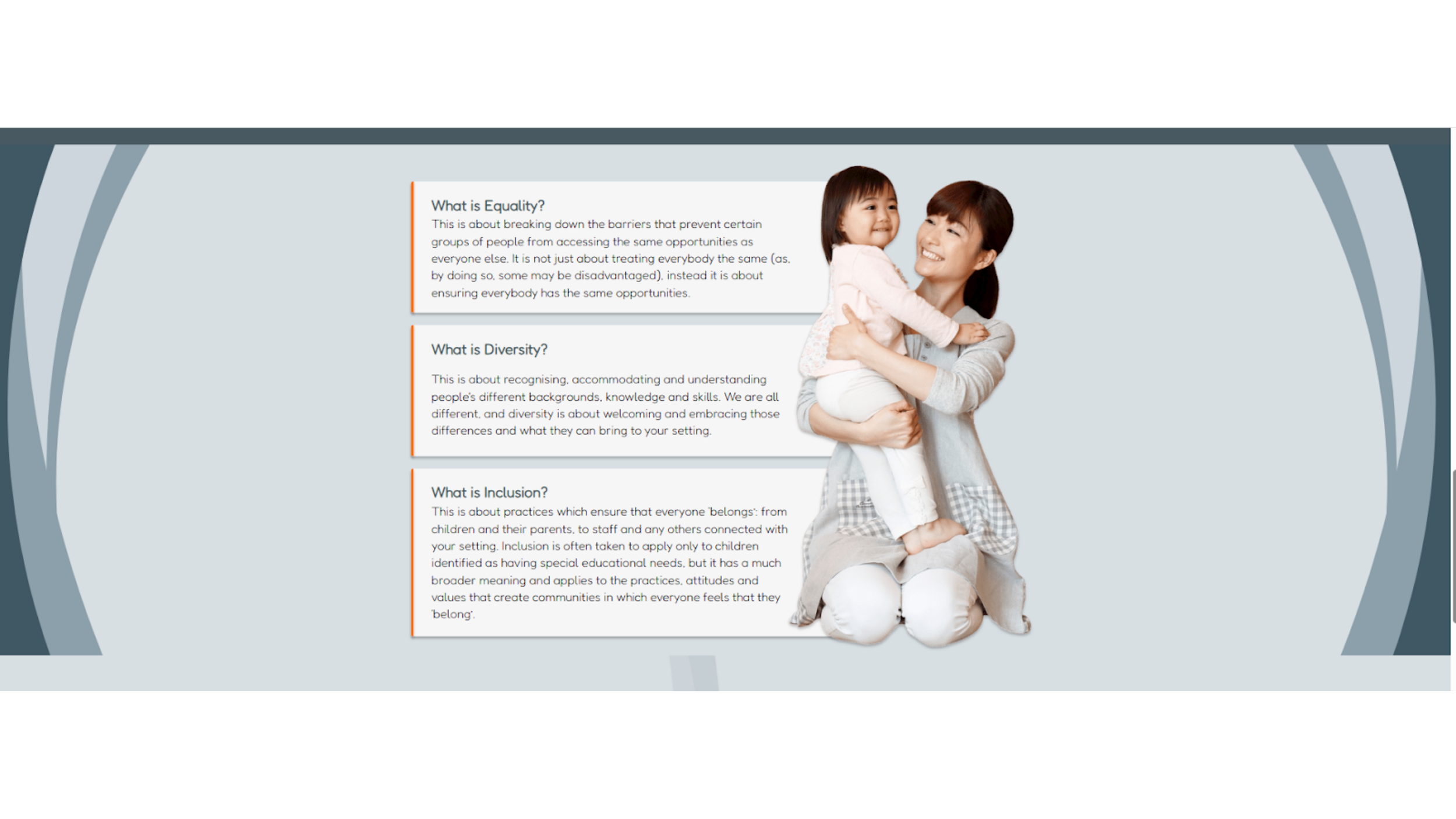
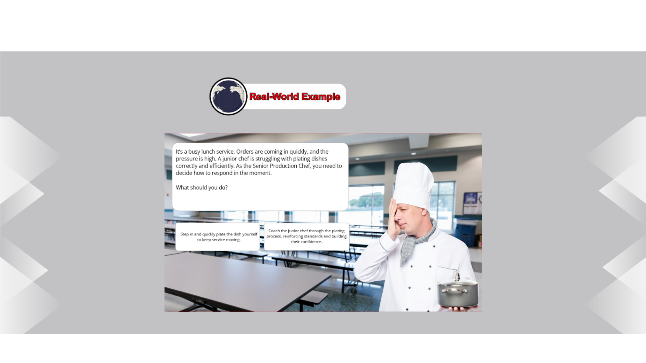
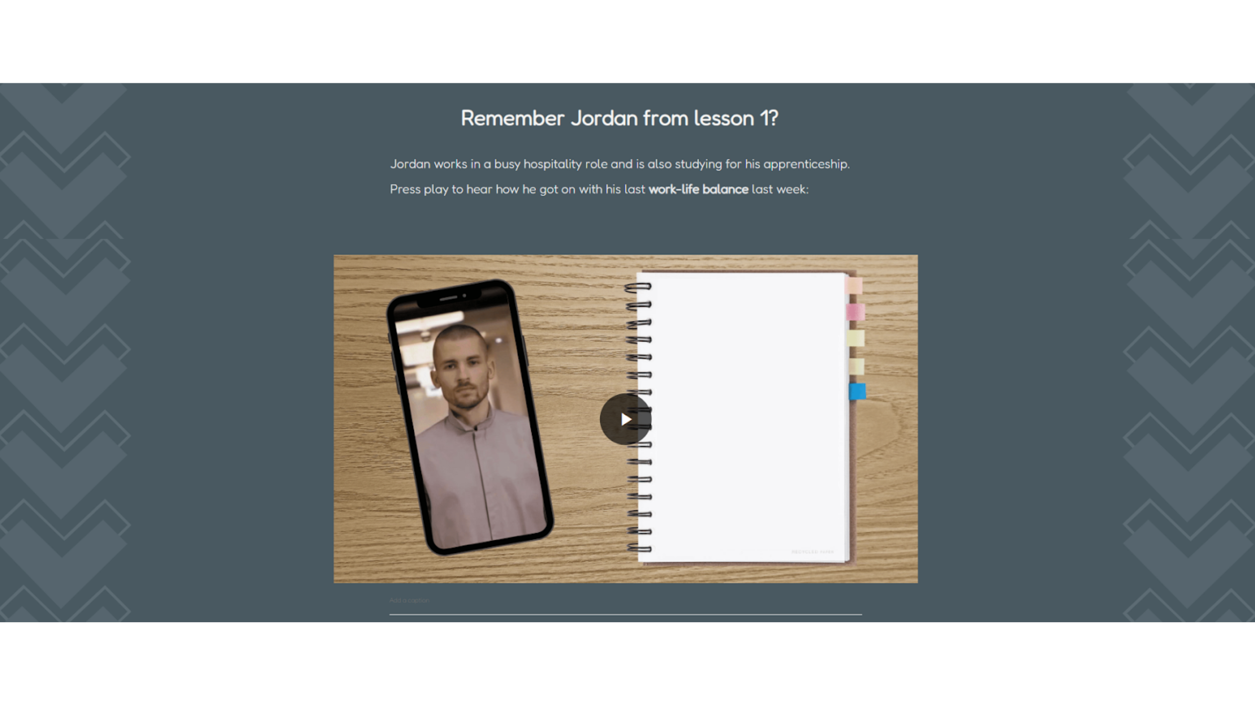
Imagery
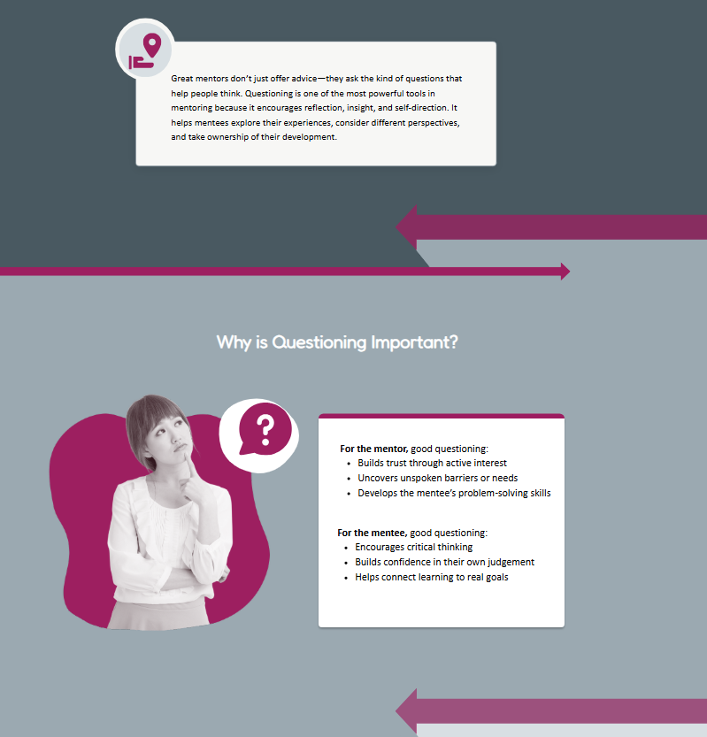
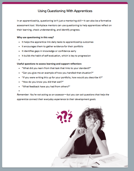
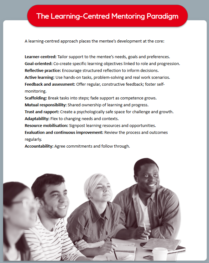
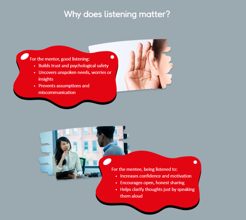
In redesigning the eLearning experience, I re-evaluated imagery through WCAG accessibility standards and core visual design principles.
Instructional images were optimized for clarity, relevance, and alignment with learning objectives, while decorative images were refined to remain consistent, predictable, and non-distracting.
I established a cohesive visual system in which all imagery features real people paired with an abstract “blob” shape for containment and harmony. Blob shapes use brand colors or grey to reinforce identity while maintaining accessibility. A duotone treatment was introduced to reduce cognitive load, increase predictability, and enhance visual appeal without competing with core learning content.
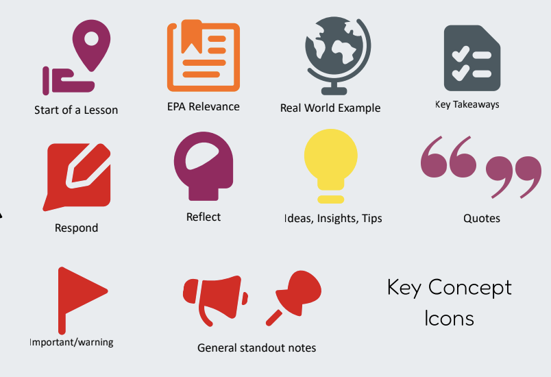
Iconography
For iconography, I prioritized consistency and clarity to strengthen meaning-making within the learning experience.
Guided by accessibility research and design system best practices, I replaced inconsistent custom icons with a unified Streamline library. Using a single icon family ensures stylistic cohesion and reinforces recognition of recurring concepts.
A defined set of key icons was established for specific instructional purposes and used consistently throughout. Additional icons from the approved library may be used for custom Rise blocks or Canva infographics, with limited flat-style exceptions. This structured approach ensures visual cues support learning rather than distract from it.
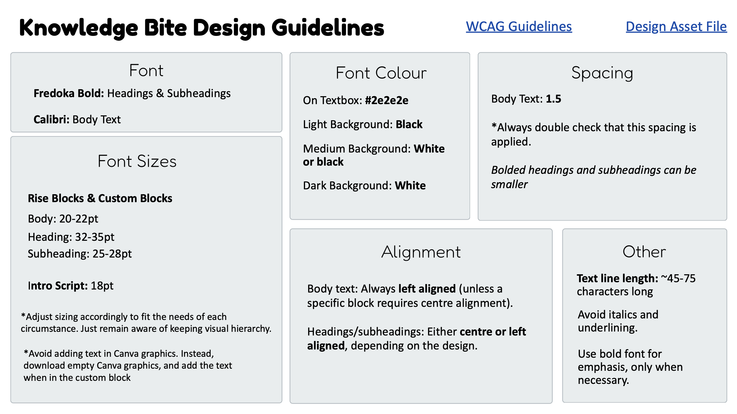
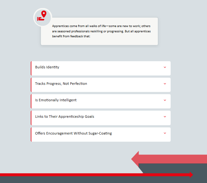
Design Guidelines
I developed a comprehensive set of Knowledge Bite Design Guidelines grounded in WCAG research and accessibility best practices. The system defines clear standards for typography (hierarchy, sizing, spacing), color contrast, alignment, and information hierarchy to ensure readability and consistency. It also establishes structured rules for navigation, interaction, and responsiveness—ensuring design supports learning rather than distracts from it.
Beyond accessibility, the guidelines formalize a cohesive visual language, including image treatment, iconography, text box styling, accent color use (one per lesson), and section dividers. Detailed implementation guidance ensures consistency across Rise, Storyline, and Canva while avoiding common accessibility pitfalls. The result is a scalable, repeatable design system balancing brand cohesion, clarity, and learner-centered usability.
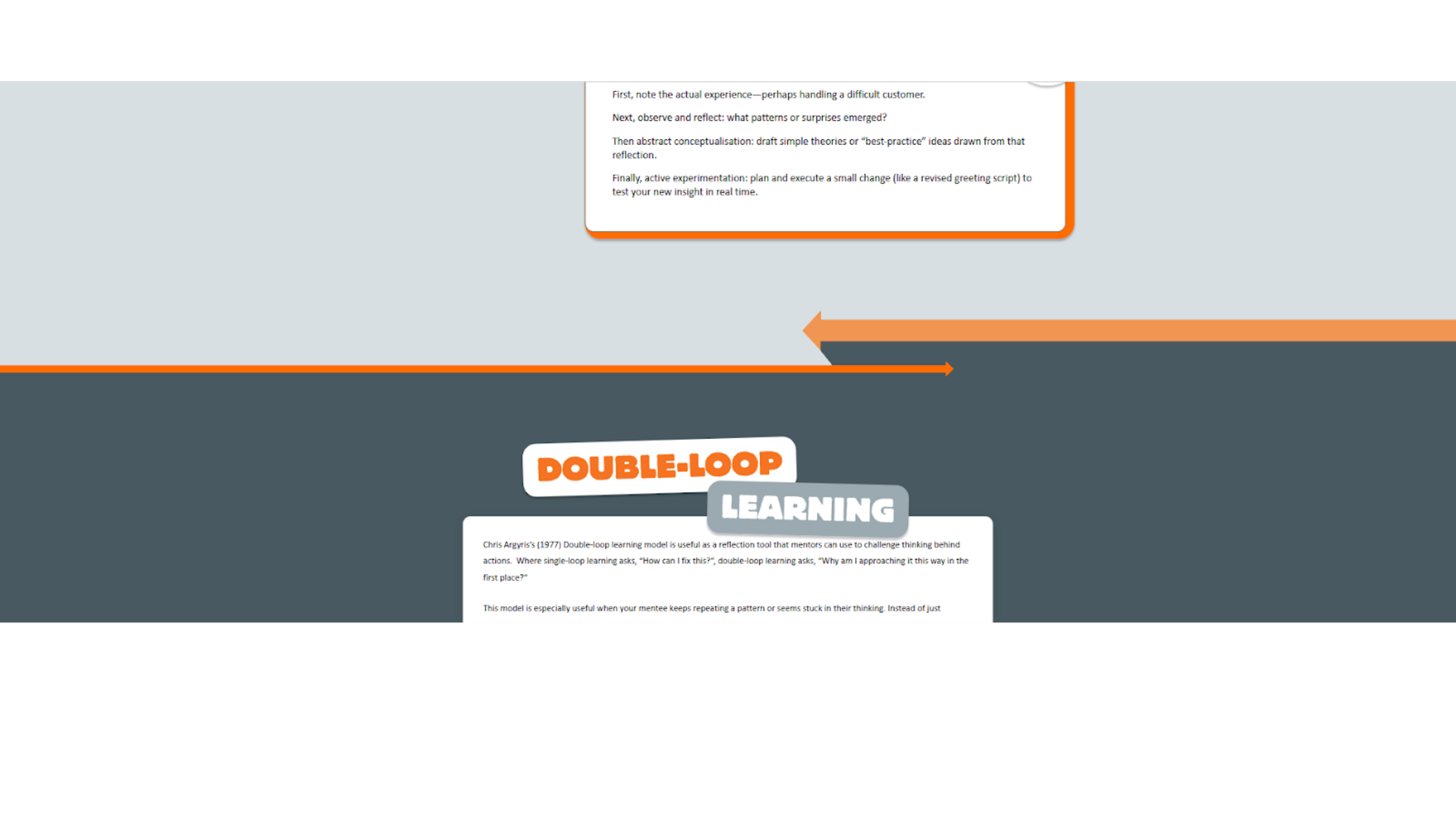
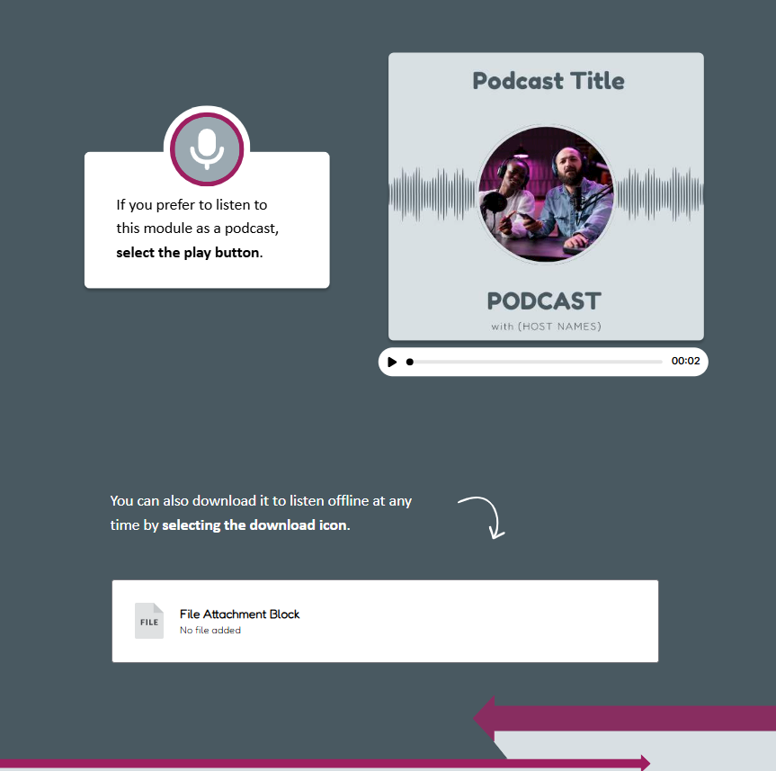
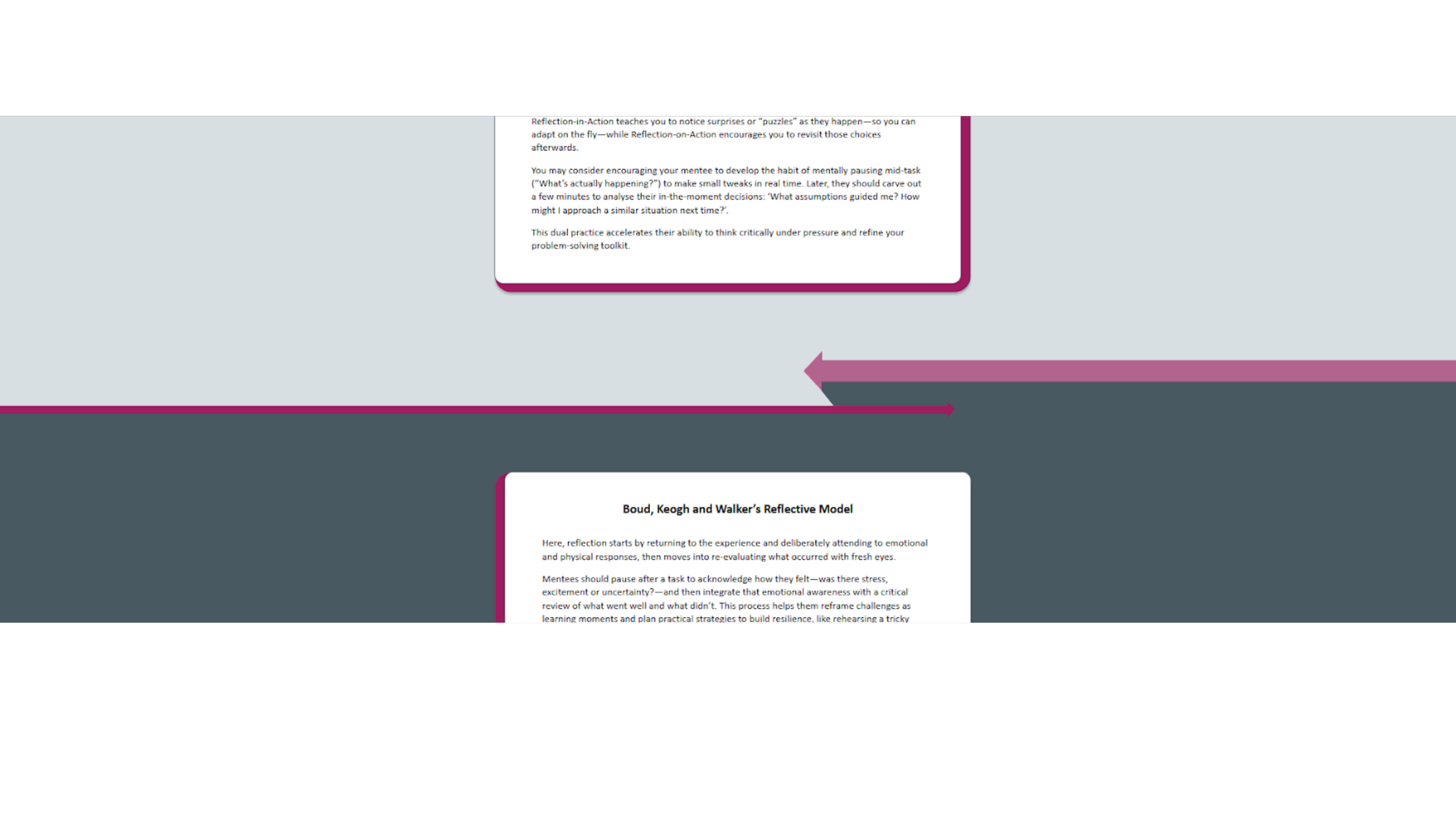
Dividers
To create visual rhythm within a monochromatic grey brand palette, I designed a system of graphic dividers that add movement and hierarchy without compromising accessibility. Working within WCAG contrast standards, I introduced bold directional arrow motifs and structured color bands to guide the learner’s eye and reinforce progression between sections.
These dividers serve both aesthetic and functional purposes: they break up long-scroll content to reduce cognitive fatigue and clearly signal transitions between key concepts. Accent colors are used sparingly to maintain contrast and clarity. The result is a simple, intentional design system that enhances engagement, supports usability, and elevates a minimal visual identity.
Before:

After: